Introduction
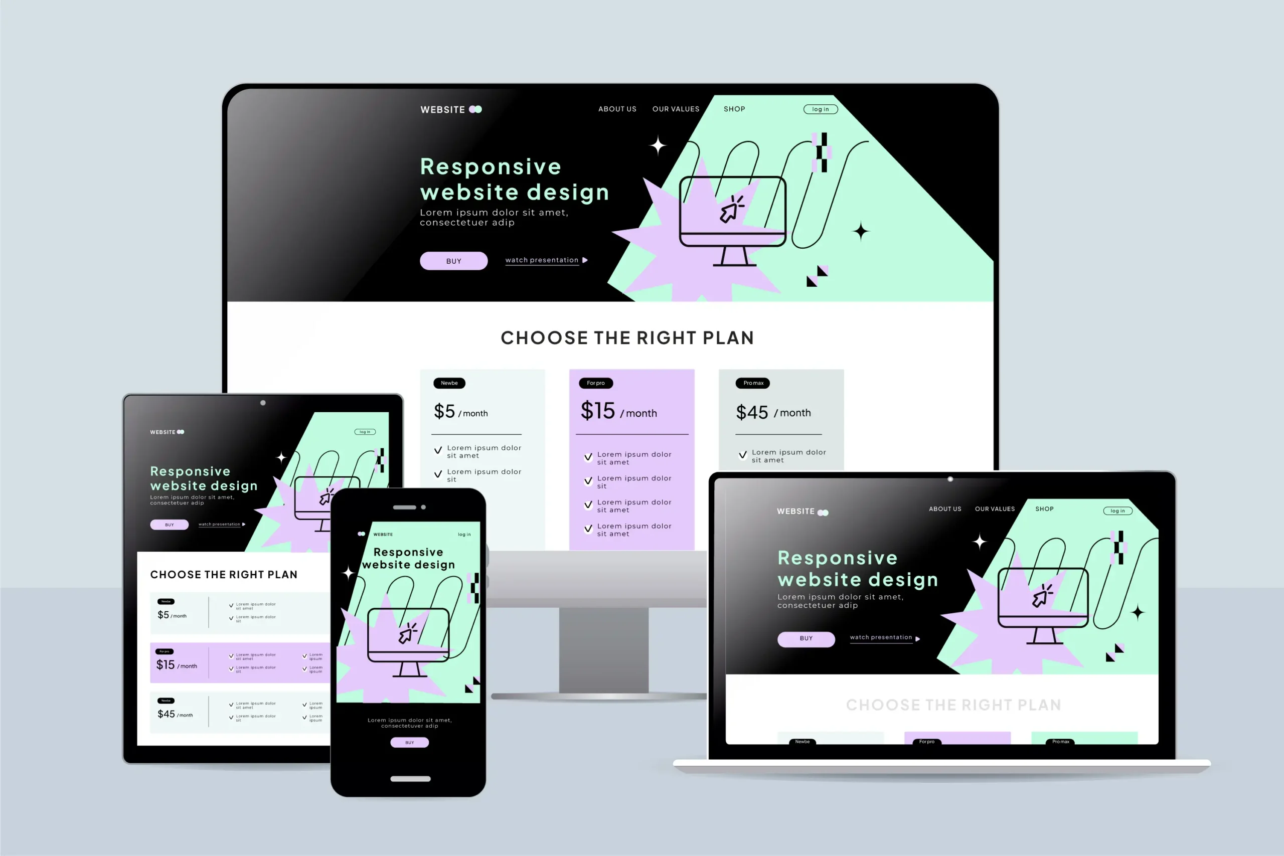
In 2025, having a beautiful website isn’t enough—it must also be responsive. As more users browse on mobile devices and Google prioritizes mobile-first indexing, responsive web design has become essential not just for user experience, but for search engine optimization (SEO) too. In this blog, we explore why responsive design is a must-have for any business serious about online growth and visibility.
1. Google’s Mobile-First Indexing
Google now primarily uses the mobile version of a website to determine rankings. If your site isn’t mobile-friendly, your search visibility can take a major hit.
Key Takeaway: A responsive website is not optional. It’s a ranking factor.
For help creating mobile-first websites, explore our Web Design & Development services.
2. Improved User Experience = Lower Bounce Rates
A responsive design ensures your website adjusts seamlessly to different screen sizes—leading to easier navigation, better readability, and a smoother experience.
Why it Matters: Happy users stay longer, visit more pages, and convert better. Google rewards this behavior with higher rankings.
Need help with user-focused design? Check out our UI/UX Design & Optimization services.
3. Faster Load Times Across Devices
Responsive websites are easier to optimize for performance. Clean code, optimized images, and streamlined design improve Core Web Vitals like:
- Largest Contentful Paint (LCP)
- First Input Delay (FID)
- Cumulative Layout Shift (CLS)
All of which are confirmed SEO ranking factors.
Learn how we improve speed and SEO with our Search Engine Optimization solutions.
4. Better Link Building & Sharing
When a single URL works across all devices, it’s easier to share and link to your site. No need for separate mobile URLs or confusing redirects.
Bonus: You consolidate SEO efforts into one version of your site, making link equity more powerful.
Building a brand? Our Branding & Visual Identity services ensure your design is both responsive and memorable.
5. Lower Maintenance & Higher ROI
Maintaining one responsive website is faster and more cost-effective than managing separate mobile and desktop versions. That means less time spent fixing bugs and more time focusing on growth.
Added Bonus: You get a higher return on your SEO and design investment.
Looking to upgrade your site? Our Figma to Web Development service transforms static designs into fully responsive, SEO-optimized websites.
6. Conclusion: Design Smart, Rank Higher
Responsive web design is no longer just a trend—it’s a foundational part of SEO success. If you want your business to rank higher, attract more visitors, and provide an exceptional user experience, investing in responsive design is non-negotiable.
Want expert help building a responsive, search-friendly website? Get in touch with XCONS for a free consultation today!